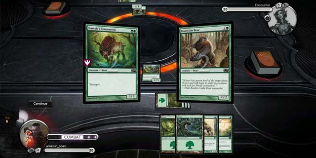
As a kid, I loved trading card games such as Konami’s Yu-Gi-Oh! or Nintendo’s Pokémon, playing matches with other kids at school, trading on the playground and arguing over the best cards and strategies. One game that I never got into was Magic: The Gathering, a trading card game targeted toward an older audience, sporting high-fantasy card art designs and more mature themes. I went into Duels of the Planeswalkers 2013 as an absolute newcomer, knowing absolutely nothing about its rules, cards or workings. In the end, I am glad I did, as it allowed me answer two questions: does it serve as an adequate introduction to the trading card game for new players, and is the game good enough to stand on its own without relying on its source material?
What’s new in Magic 2013
This year’s installment does two new things, one by request and one out of necessity. There’s now a manual mana tapping option, which (while it makes sense to try to automate that) can get you around some tricky plays that need a specific set of mana to pull off. The second, replacing the Archenemy campaign with one showing off Planechase, is part of the company’s plan to simultaneously switch up the Duels experience and market whichever spin-off format for which it’s currently printing new cards. – Graham Russell
Luckily, the game allows you to select your level of experience with Magic: The Gathering at the beginning, and will adjust difficulty and tutorials accordingly. Duels 2013 offers a tutorial match at the start to allow you to get your bearings, as well as offering hints and strategy suggestions in later matches, to ensure you are never at a loss for direction. I found these tips to be a good method for easing into the innately-complex game mechanics.
You and your opponents are restricted to decks that use cards with few extra abilities and tactical intricacies early in the game, so as to not overwhelm the player. I can imagine that these opening rounds might become tiresome for veterans of the game, who have to wait until much later in the game to get access to rarer cards and advanced deck editing possibilities. I actually think that the developers should have loosened the leash a bit; it takes a long while before you are able to have any sort of flexibility with your deck design, and I would have liked to start editing my strategy once I got the basics down. Overall, Duels 2013 does a fine job of introducing players to a set of complicated gameplay mechanics quickly, but does a bit too much hand-holding, even once the basics of gameplay have been established.

iPad impressions
This marks the first year that Duels has seen an iOS release (though it’s iPad-only). The platform is great for games like this, and it runs fairly well, but there was just a bit of shoehorning. Since it’s running the same game, the drag-and-drop functions aren’t the most intuitive, and the tilted table looks cool but isn’t the most functional.
Still, it’s a nice version, and you can try it for free before plunking down the $10 full game as an in-app purchase. – Graham Russell
The one issue I have with the game is that its progression is as slow as molasses. After each successful match, a new card for your deck is unlocked. This means that you have to keep playing matches to unlock cards, one at a time. This is understandably tedious, and doesn’t seem nearly as practical as the method of receiving an entire new pack of cards, like in the Pokémon TCG or Yu-Gi-Oh! video games. It takes forever to be able to gain flexibility in deck editing and to actually have any say in the workings of your deck. Once you do amass a reasonable amount of unlocked cards, there still isn’t a whole lot you can do, other than choose which cards aren’t in your deck. This means that duels revolve more around luck than anything. There really is no excuse for not offering deeper deck-building tools; TCG video games have been doing this since the genre’s inception, and it would have gone a long way here.
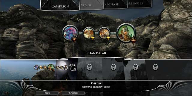
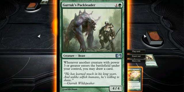
The art direction of the game offers some very stylized, detailed 2D drawings for cutscenes, in addition to the art already on the cards. These portions are well-made, and accurately reflect the tone of the game. There is one part of the aesthetic that bothers me greatly, however: the background to the game’s menus are done in 3D. The models used look ugly, the textures are bland and dull and everything carries the fidelity of an early PS2 game. I know that menu backgrounds are a relatively inconsequential aspect of a game, but the decision to use awkward 3D graphics really distracts from the game’s overall aesthetic that would have been left alone. If the developers had decided to substitute this for the 2D art found everywhere else in the game, the game would have a much more consistent visual theme that would have been a benefit to the game’s otherwise-fine presentation.

Duels of the Planeswalkers is a good attempt at bringing Magic: The Gathering to a digital medium. All the basics are done well, and the duels effectively translate the sense of risk and tension that all good TCG video games should have. However, the lack of worthwhile deck customization could still be a dealbreaker for some players.
Pros: Good translation of the card game, excellent 2D art
Cons: Little to no deck customization


